
The Checkbox field helps you capture binary choices—yes or no, true or false—directly within Smackdab.ai.
Whether you're tracking consent, subscription preferences, or feature toggles, the Checkbox field is a simple yet powerful way to manage clear, on/off data points.
Let’s explore how to configure and customize your Checkbox field!
Adding a Checkbox Field
To create a Checkbox field in Smackdab.ai, follow these steps:
-
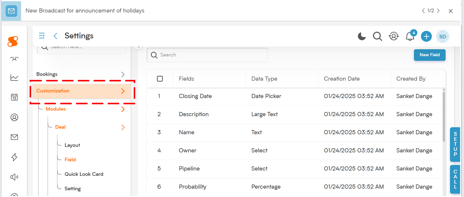
Go to Settings → Navigate to Customization.
-
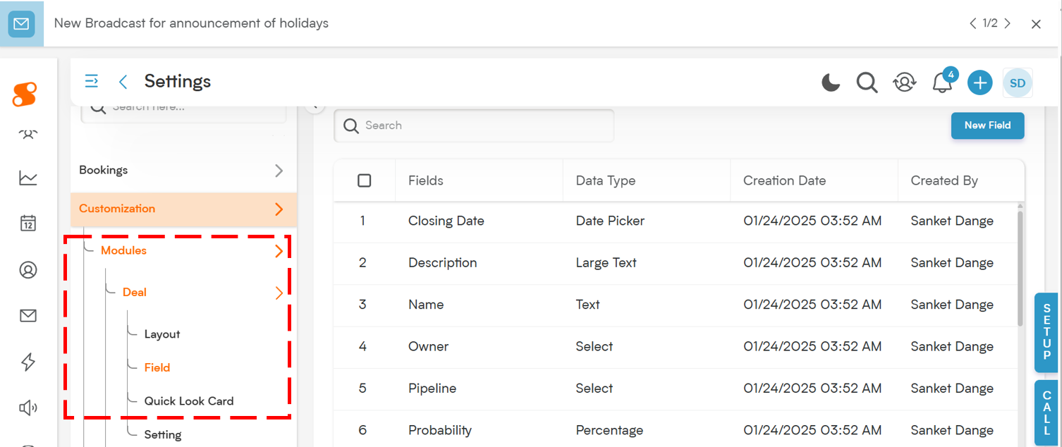
Select Modules → Choose the module where the phone field should be added (e.g., Contacts, Deals, Companies).
-
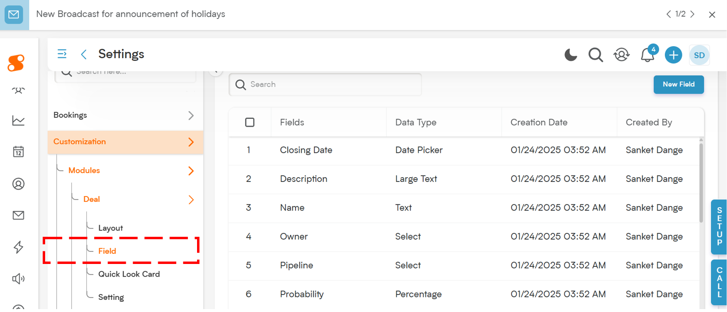
Choose the Field Section → Select the section in the entity where this new field will go.
-
Click "New Field" → Choose New Field to create a custom field.
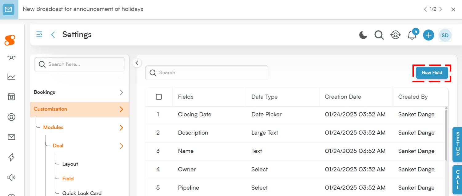
Choose Field Type → Select "Checkbox" to add this binary selection field.
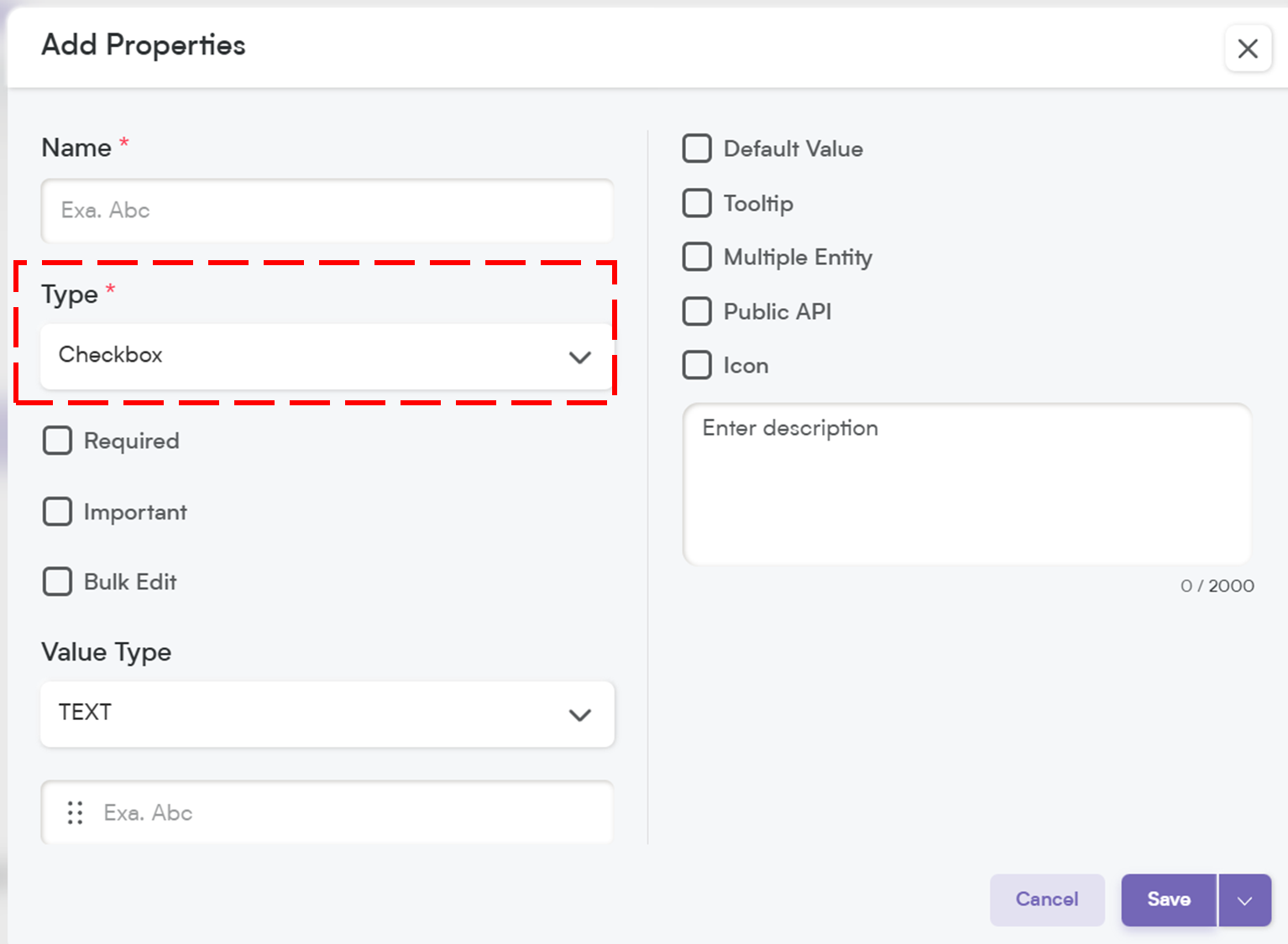
Customize Your Checkbox Field Settings
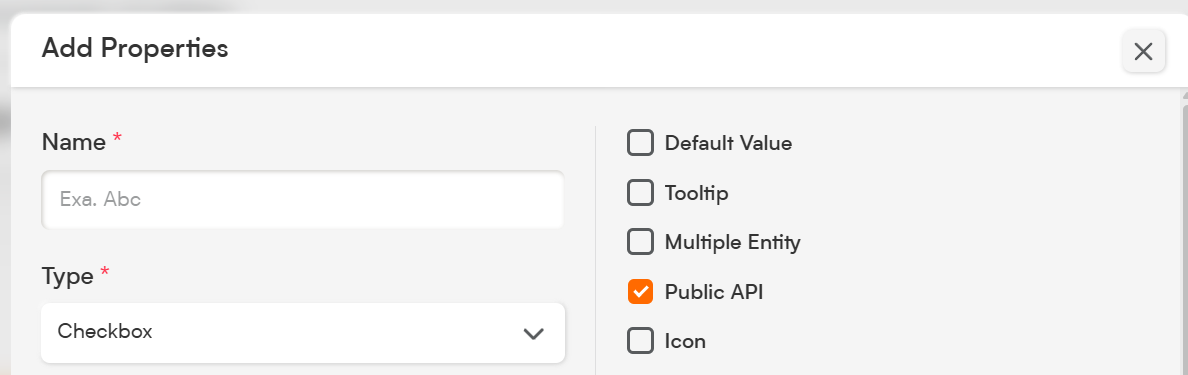
When setting up your Checkbox field, you’ll have several customization options.
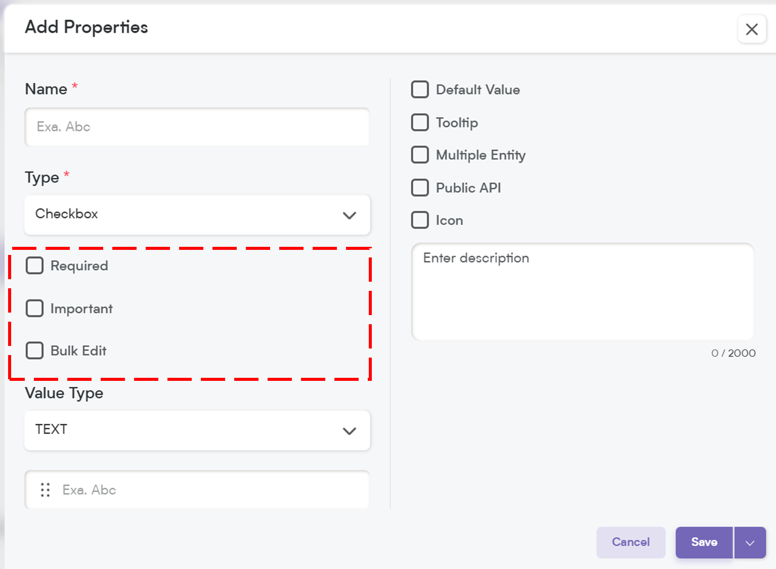
1. Select Options to Customize Field Behavior
-
Required – If this field is marked as required, it will be highlighted with an asterisk (*), meaning users must check the box before they can save the record.
💡 Note: If you mark a field as required, it will automatically be included in the Public API and added to the Field Layout. If the field is not required, you will need to manually add it to the Public API and field layout.
Important – While not required, marking a field as Important highlights it with an orange dot, making it stand out so users knookl.w it’s crucial to update.
Bulk Edit – Allows users to update this field for multiple records at once, saving time when making mass changes.
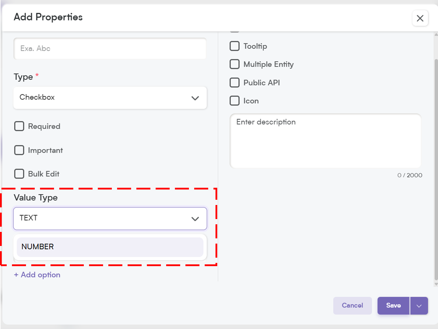
2. Add Option & Define Value Type
You can define what the checkbox represents when checked. Choose the value type—either Text (e.g., "Yes", "Subscribed") or Number (e.g., 1 for checked, 0 for unchecked).
📌 Example Value Type:
Text → “Confirmed”
Number → 1
This allows for more flexible filtering and automation down the line.
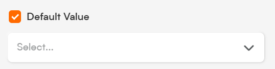
3. Default Value
Set a default value for the checkbox—either Checked or Unchecked—to ensure consistency across new records.
📌 Example:
If the majority of users opt-in by default, set the default to “Checked.”
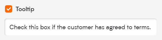
4. Tooltip
A small pop-up message that appears when users hover over the field. This is great for giving extra instructions or context without cluttering the interface.
📌 Example Tooltip:
"Check this box if the customer has agreed to terms."
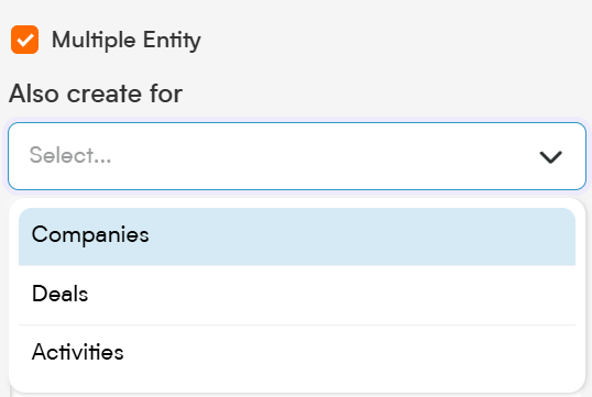
5. Multiple Entity
This allows the Checkbox field to be used across multiple modules (e.g., Contacts, Deals, and Companies) instead of being limited to just one. Perfect for shared data points!
6. Public API
When you enable the Public API option, this field becomes accessible for integration with other applications. This means it can be included in API exports, allowing seamless data exchange between Smackdab.ai and external systems.
If the field is marked as Required, it will automatically be added to the Public API and included in the default field layout.
If the field is NOT required, you will need to manually enable Public API access to make it available for integrations.
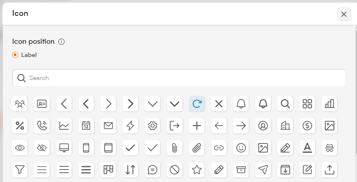
7. Icon
Assign an icon to visually represent the field, making it easier to recognize and improving user experience.
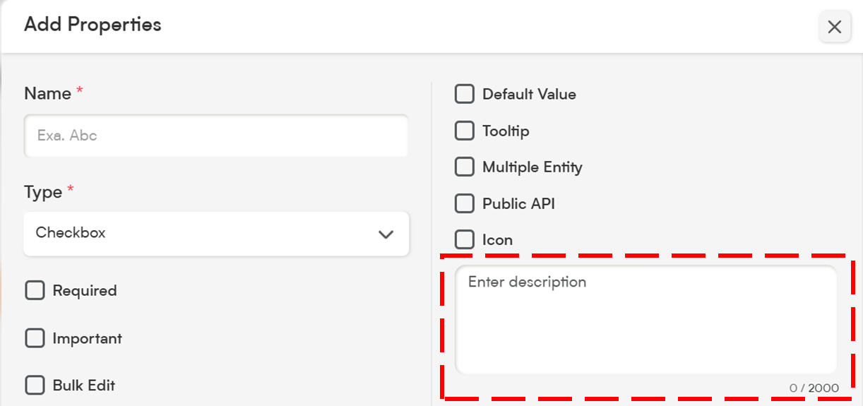
8. Description
The Description provides clarity on the purpose of this field. A well-written description ensures that both users and AI can interpret the data accurately.
A detailed description helps Smackdab.ai generate insights and use this field for automation and analytics.
The Checkbox field is ideal for quick, binary decisions and helps streamline your CRM workflows.
Whether you're using it for opt-ins, confirmations, or toggling optional features, Smackdab.ai’s Checkbox field ensures data is clear and consistent.
Start configuring your Checkbox field today and keep your records smart and simple!