
Dropdown fields are a powerful way to standardize data entry and make record updates more efficient.
Whether you need users to select a status, choose from predefined categories, or link data from other entities, dropdowns make it simple and structured.
In Smackdab.ai, you can customize dropdown fields to fit your needs, from adding color-coded options to pulling data dynamically from other records.
Let’s dive into how you can configure them!
Adding a Dropdown Field
To create a dropdown field:
Go to Settings → Navigate to Customization
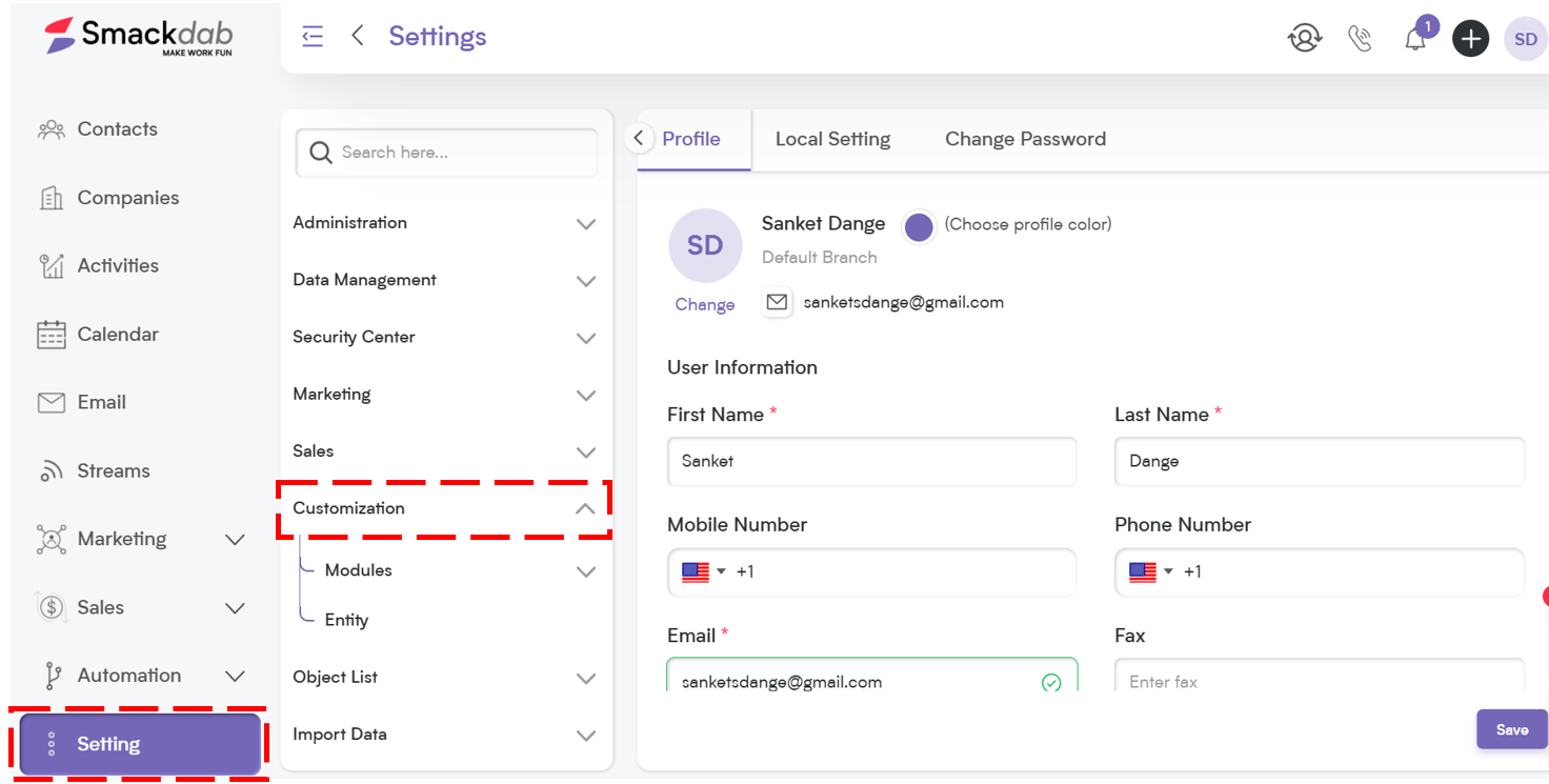
Select Modules → Choose the module where you want to add the dropdown (e.g., Deals, Contacts, Companies, Activities).
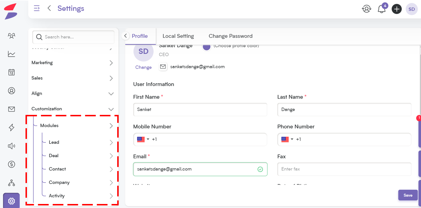
Choose the Field – Select the field dropdown within the chosen entity where you want to add the new Dropdown field.
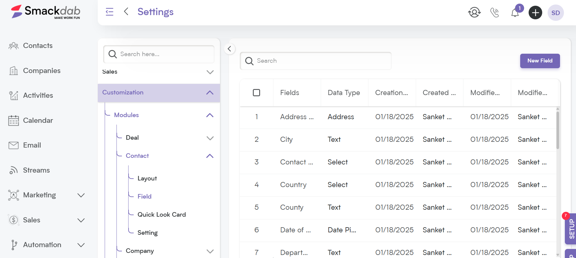
Click on "New Field" → Select New Field to add or edit field type.
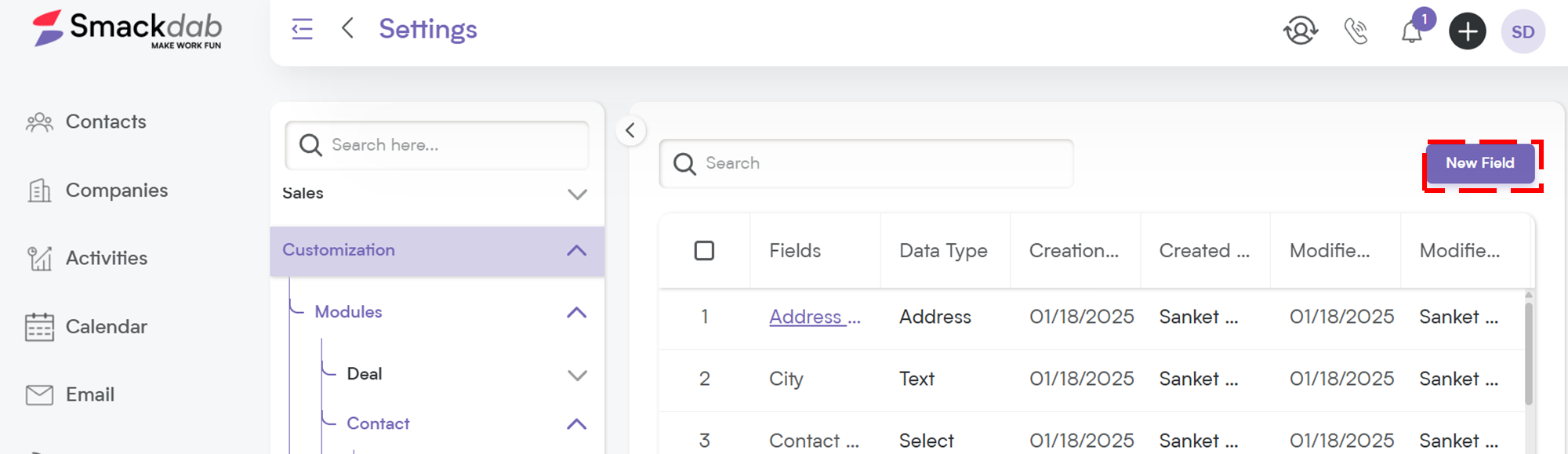
Choose Field Type – Select 'Select' as the field type to get dropdown options
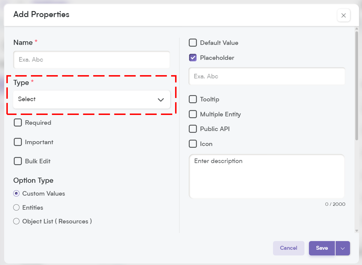
Select One Option to Customize Field Behavior to Fit Your Needs
When setting up your field, you’ll have a few options to customize how it behaves. Here’s a quick breakdown of what each setting does:
-
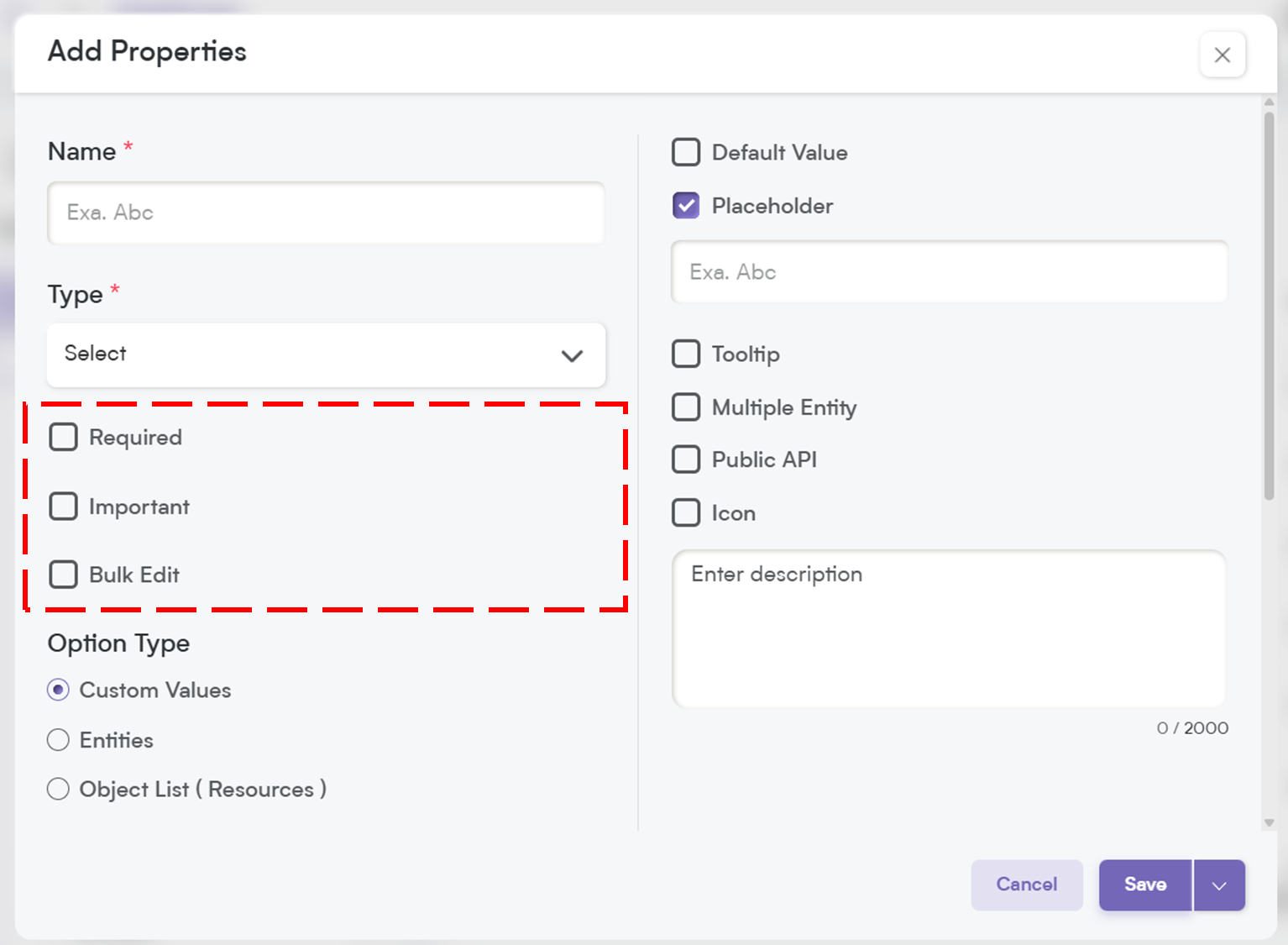
Required – If this field is marked as required, it will be highlighted with an asterisk (*), meaning users must fill it out before they can save the record.
💡 Note: If you mark a field as required, it will automatically be included in the Public API and added to the Field Layout. If the field is not required, you will need to manually add it to the Public API and filed layout.
Important – While not required, marking a field as Important highlights it with an orange dot, making it stand out so users know it’s crucial to update.
Bulk Edit – Allows users to update this field for multiple records at once, saving time when making mass changes.
These options give you more control over how your data is structured and ensure a smoother workflow for your team.
7. Values List: Customize Your Dropdown Options:
When setting up a dropdown field, you get full control over the values list—the options users can select from.
You’re not limited to just static choices; you can decide how these values are generated and displayed.
Smackdab.ai gives you three ways to define dropdown options:
Custom Values – Manually enter your own list of options. Perfect when you have predefined categories, like Lead Status (New, Contacted, Qualified).
Entity-Based Values – Pull options from an existing Smackdab entity, such as Leads, Deals, or Users. This is great for dropdowns that need to stay in sync with your CRM records.
Object List – Use predefined system objects that dynamically update based on changes in your database. Ideal for dropdowns that rely on system data.
This flexibility means your dropdowns can be as simple or dynamic as you need, ensuring users always select the right option with ease!
-
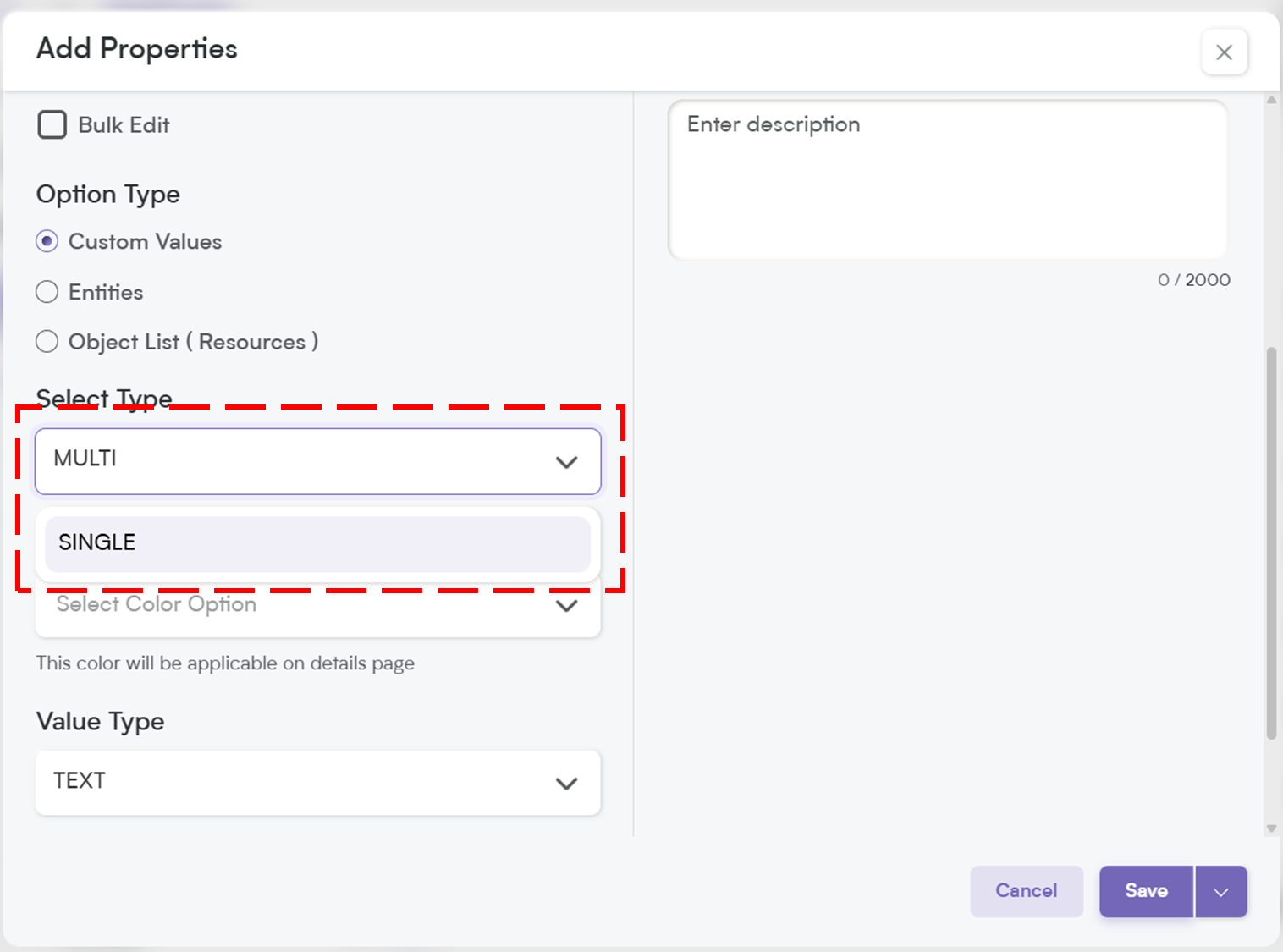
Choose the selection type
Single Select (allowing users to pick one option) or Multiple Select (enabling selection of multiple options from the list).
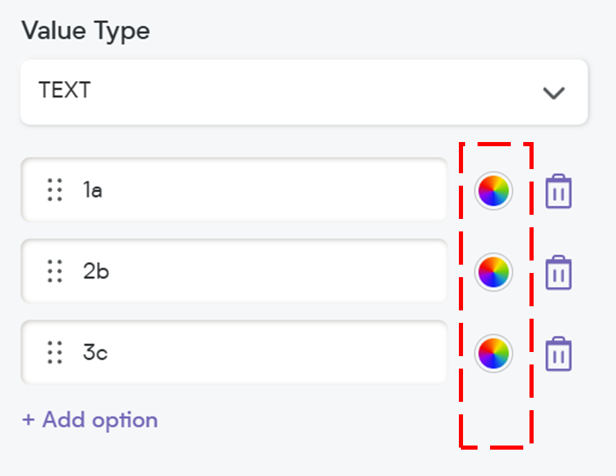
9. Customize Dropdown Colors
Smackdab.ai gives you the flexibility to personalize dropdown selections by applying colors that align with your branding.
Whether you want to highlight key options or maintain a clean look, you can fully customize the appearance to enhance usability and create a more cohesive experience for your team.
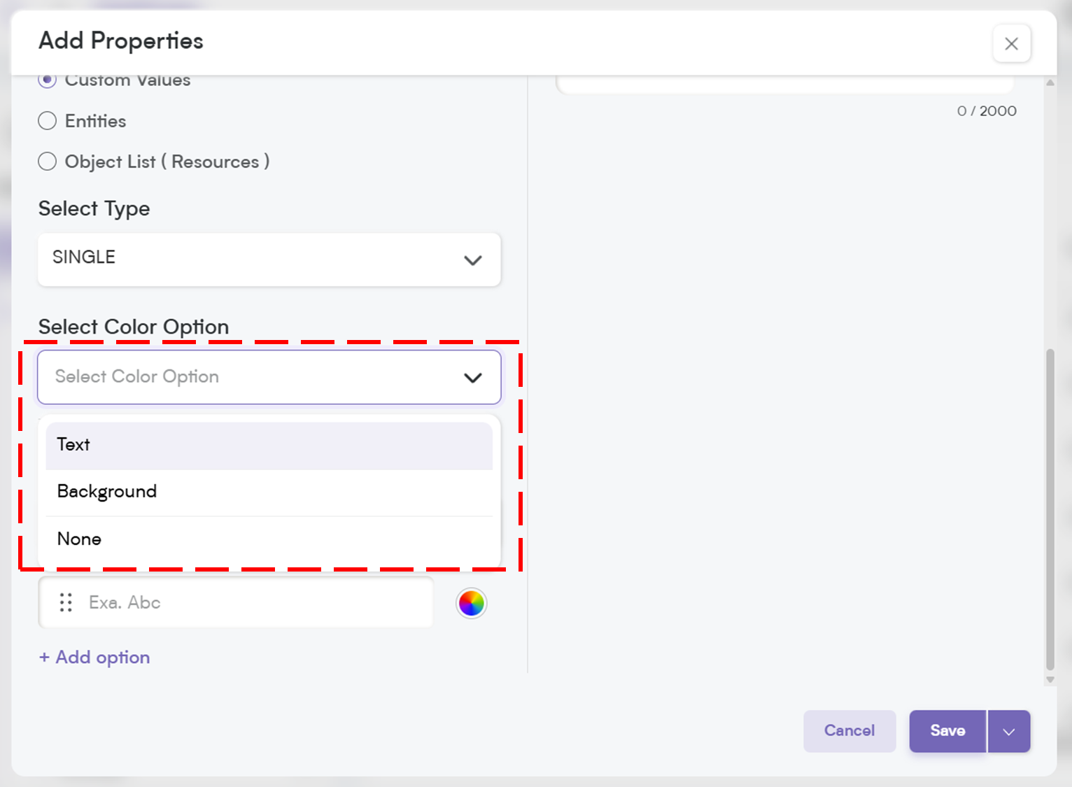
Select one from the following:
Text Color – Apply custom colors to the text of each dropdown option for better readability and emphasis.
Background Color – Highlight the background of each option to make selections visually distinct.
None – Keep the dropdown simple without any color customization.
With Smackdab.ai , you can use your brand’s colors to create a more personalized and visually engaging interface, ensuring a seamless and intuitive experience for your users.

10. Select Value Type: Text or Number:
Smackdab allows you to define the type of values your dropdown will store, giving you flexibility based on your data needs.
Text – Choose this option if your dropdown values consist of words or phrases (e.g., Status: "Open," "Closed," "In Progress").
Number – Select this if your dropdown values are numeric (e.g., Priority Level: 1, 2, 3).
By selecting the right value type, you ensure consistency and accuracy in your data, making it easier for your team to analyze and use information effectively.
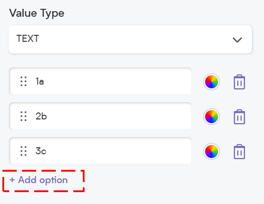
11. Add Options to Your Dropdown
Smackdab makes it easy to customize your dropdown options to fit your needs. Here’s how you can add and manage them:
Click on "Add Option" – This will open a text box where you can enter your desired option.
Additional Considerations & Character Limits
Maximum 100 options can be added to a dropdown list.
Each option can have up to 150 characters.
Type Your Option – Enter the value you want to include in the dropdown list.

Customize the Color (Optional) – If you want to assign a specific color to your option, click on the Color Option and select a text or background color. This helps visually categorize options.
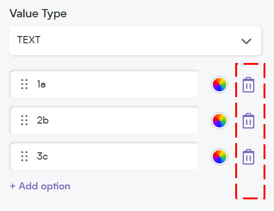
Delete an Option (If Needed) – If you want to remove an option, simply click on the Delete Option button next to it.
With these easy steps, you can create a well-organized dropdown that enhances usability and data clarity.
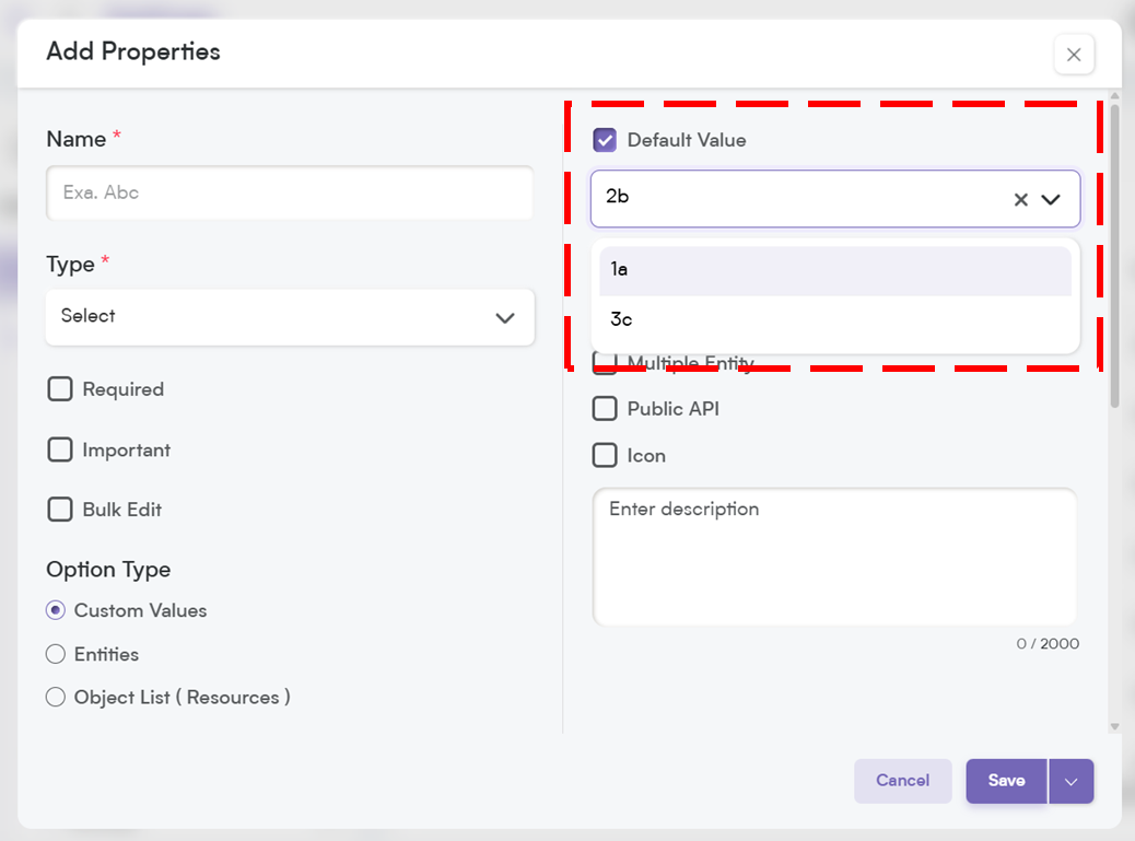
12. Default Value
Set a predefined value that automatically appears when a user fills out the field. This helps speed up data entry and ensures consistency.
Placeholder
Think of this as a helpful hint inside the field. It disappears once the user starts typing, providing guidance on what to enter.
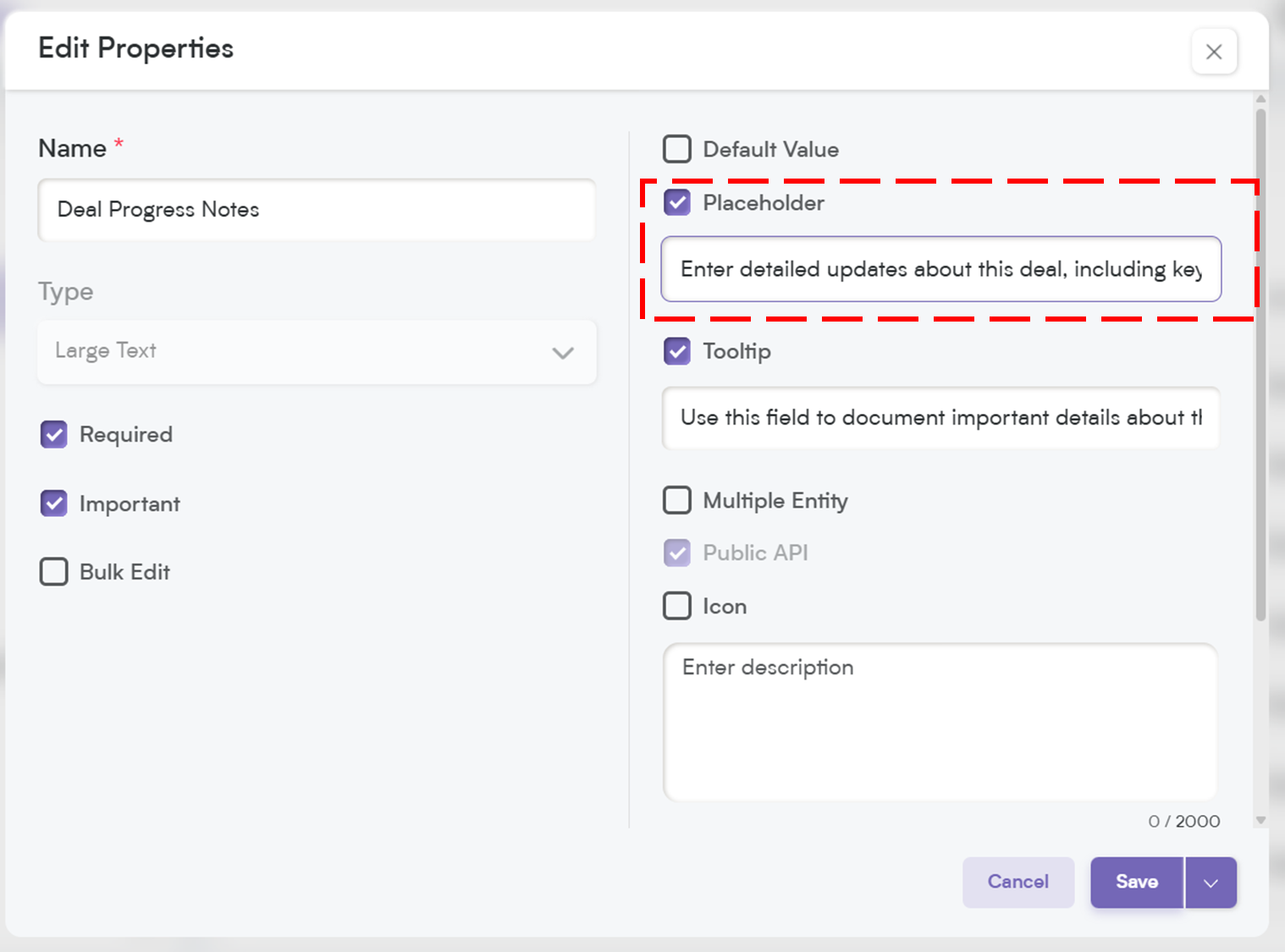
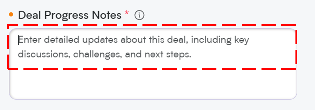
When you add a placeholder, it will appear in the record field as shown below, when users update a record you can provide clear guidance, making it easier and more intuitive for your team to enter the right information effortlessly.
Tooltip:
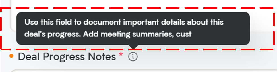
A small pop-up message that appears when users hover over the field. This is great for giving extra instructions or context without cluttering the interface.
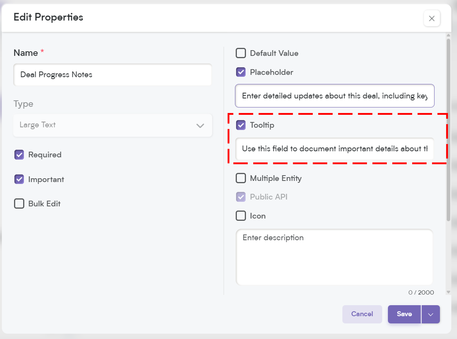
When you add a tooltip, a small "i" icon will appear next to the field name. When users hover over it, they’ll see the tooltip message—an easy way to provide quick tips or context about the field!
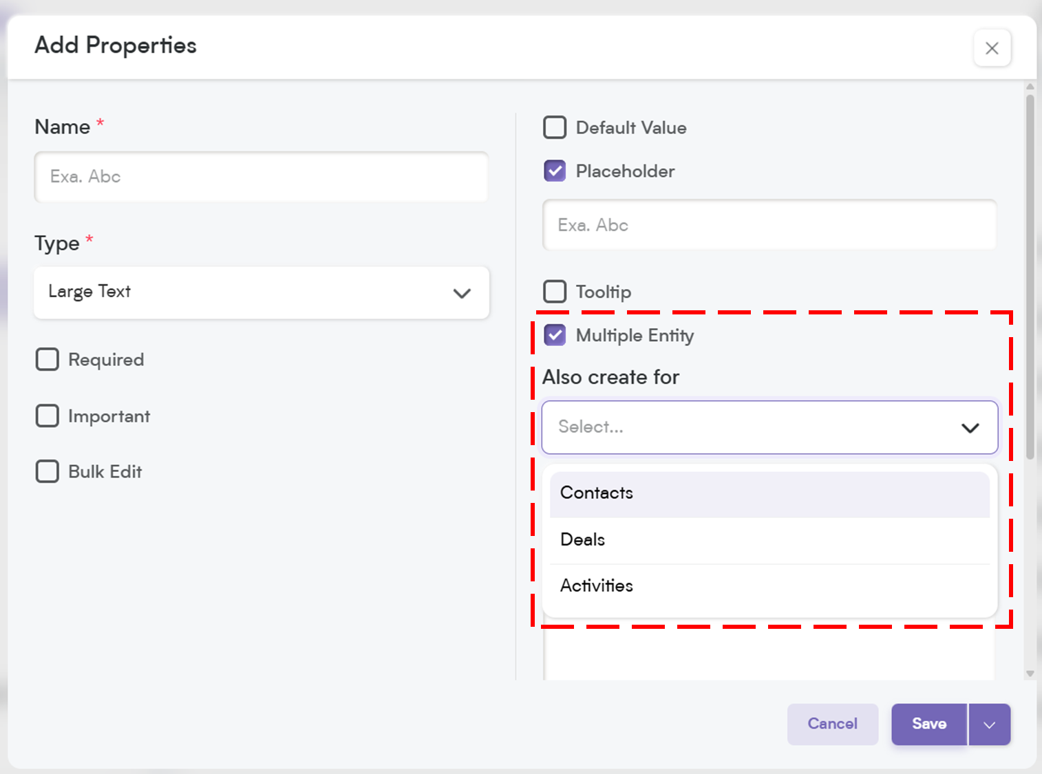
Multiple Entity:
This allows a field to be used across multiple modules (e.g., Contacts, Deals, and Companies) instead of being limited to just one. Perfect for shared data points.
Public API
Enable this option if you want this field to be accessible through Smackdab.ai. This is useful for integrating with other systems and automating workflows.
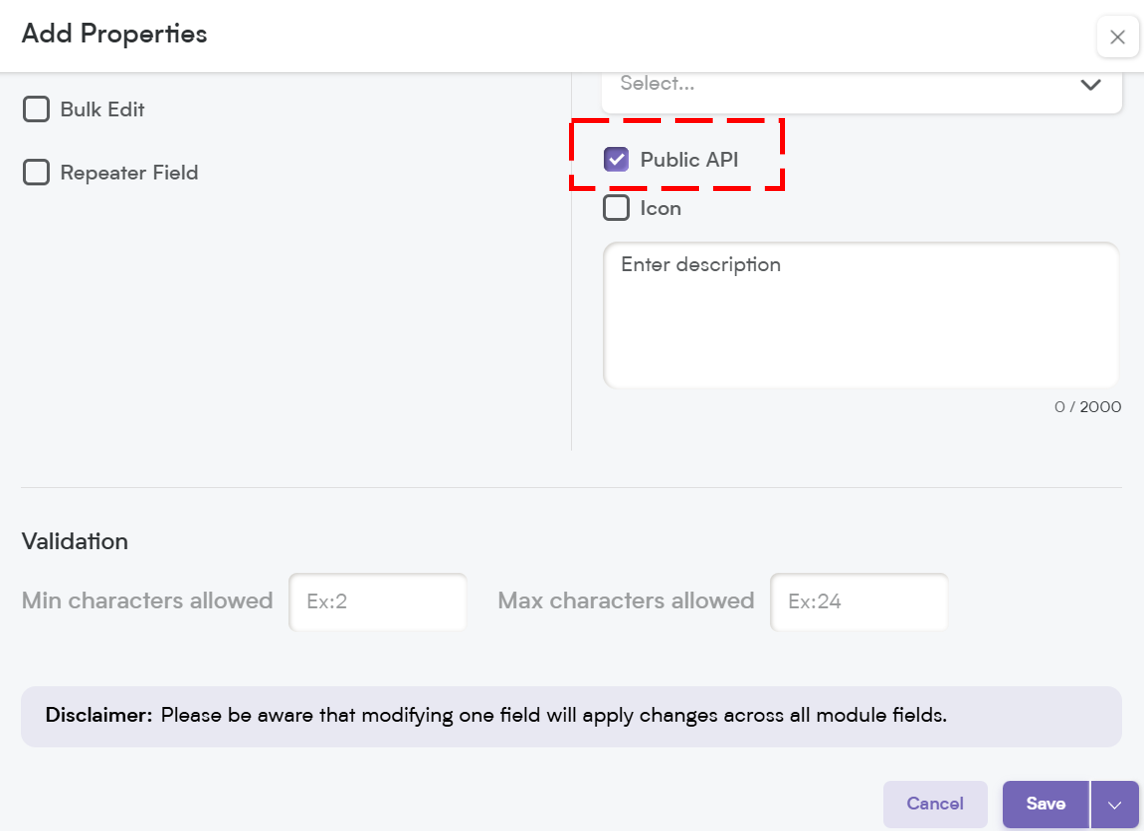
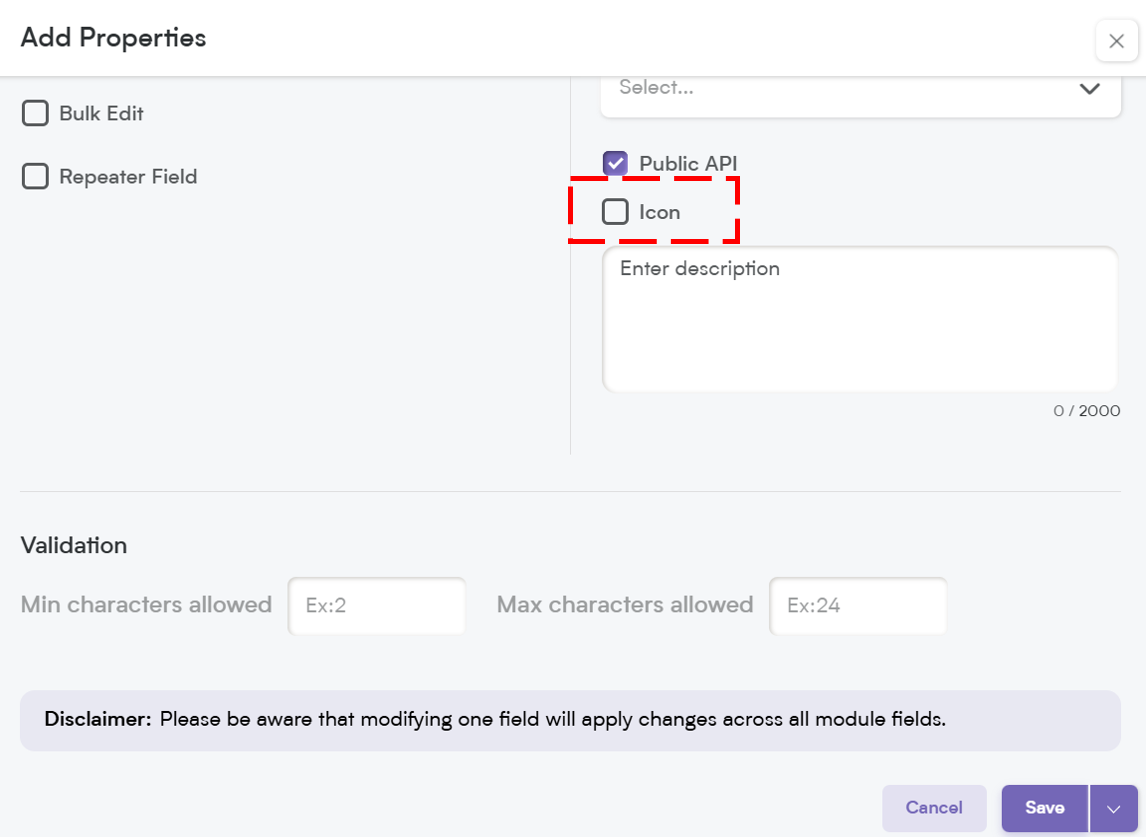
Icon
Assign an icon to visually represent the field, making it easier to recognize and improving user experience.
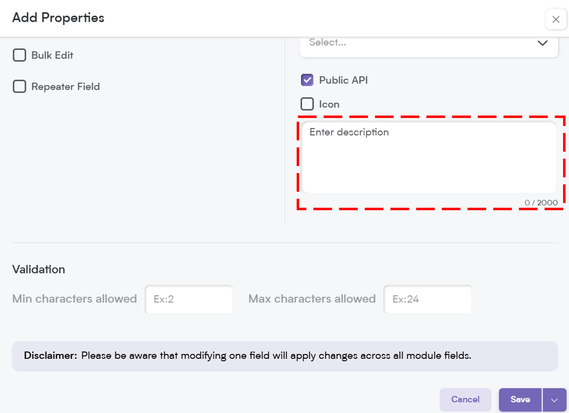
Description:
Provide a brief explanation of what the field is for. This helps ensure users understand its purpose and enter the right information.
Dropdown fields help structure your CRM data, making selection-based inputs faster and more reliable.
Whether you’re categorizing leads, selecting priority levels, or linking records dynamically, Smackdab.ai dropdown fields give you complete control over how data is entered and displayed.
Try setting up a dropdown today and see how it simplifies your workflow!