
Think of a Checkout Form in Smackdab as your friendly digital cashier, ready to help customers smoothly complete their purchases. When a customer is excited to buy, this form steps in to gather all the essential info needed to finalize the sale. It's a fantastic tool for businesses that handle payments or manage orders right within their CRM, keeping everything organized and efficient!
What Makes Up a Great Checkout Form? Let's Break It Down:
-
Getting to Know Your Customer:
Name: So you know who you're delighting!
Email: Perfect for sending order confirmations and updates.
Phone Number: Handy for any quick questions or delivery coordination.
Billing Address: To ensure everything is processed accurately.
-
The Nitty-Gritty of Their Order:
Product/Service Name: Clearly lists what they're buying.
Quantity: How many of those awesome items they want.
Pricing & Discounts: Shows the value they're getting, including any special offers.
Taxes & Shipping Fees (if they apply): Transparently outlines all costs.
-
Making Payment a Breeze:
Smackdab Pay Integration: Ready to connect and process payments seamlessly!
Credit/Debit Card Details: Securely captures their preferred card information.
Easy Payment Choices (e.g., Google Pay, Apple Pay): Offers convenient ways to pay, letting customers choose what works best for them.
Invoice Generation: Automatically creates a professional invoice for their records.
-
Helpful Extras for a Smooth Experience:
Coupon Code or Discount Field: A spot for customers to enter those sweet deals!
Smart Automation: Works behind the scenes to streamline order processing.
Clear Order Summary & Total: A quick review of everything before they confirm.
Terms & Conditions Agreement: Ensures everyone is on the same page.
"Confirm Purchase" Button: The final, satisfying click to make it official!
This makes the checkout process clear, simple, and secure for your customers, leading to happier buyers and smoother sales for your business!
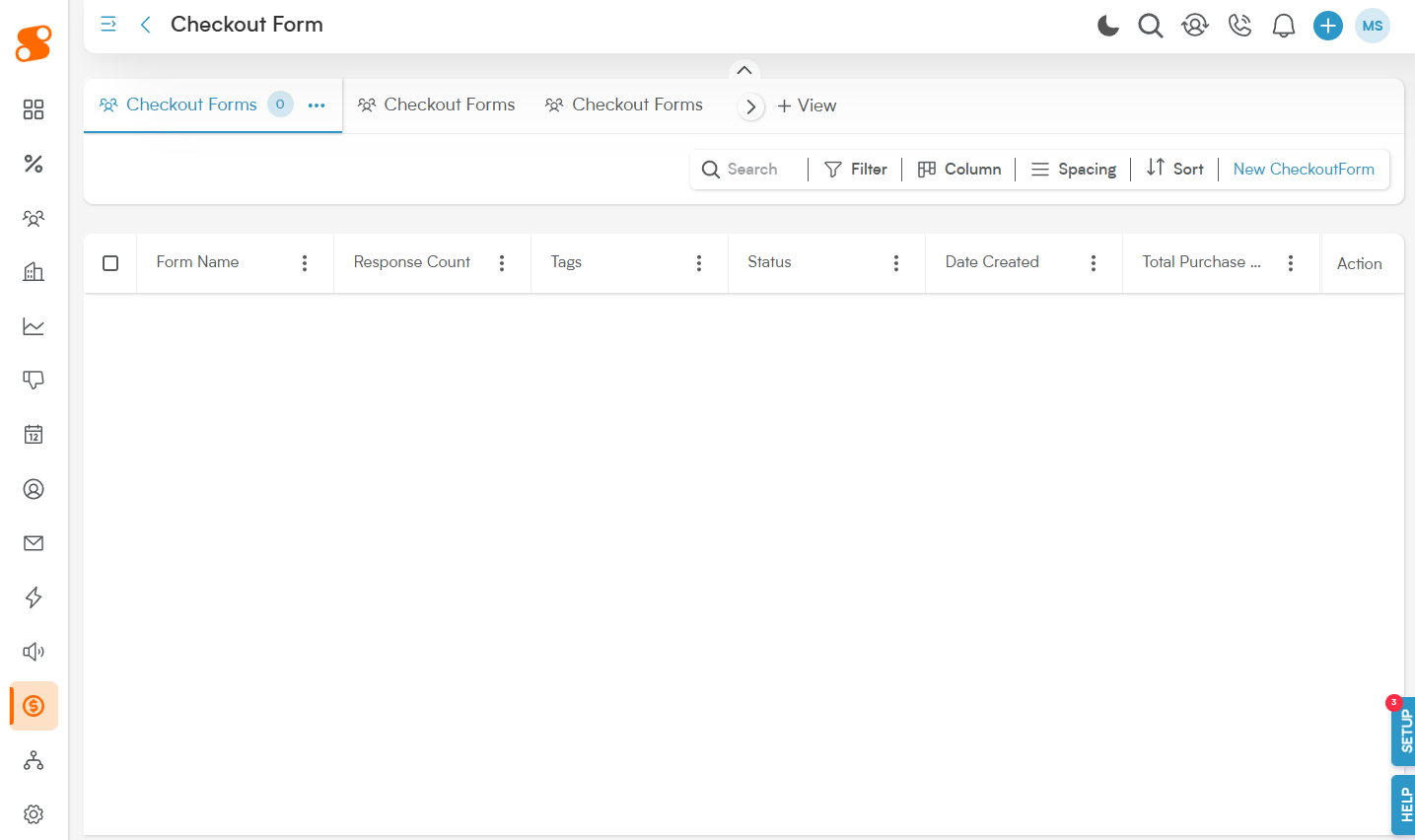
To create a Checkout Form, let's navigate to Sales>Checkout Form, and click on the "New Checkout Form" button in the top right to get started.
This will bring you to the checkout form editor page, giving you total control over the appearance and information that you gather in the form, very similar to the Booking module! Just like the Booking module, the right-side of the screen shows you a live preview of the form, allowing you to adjust it's appearance as you go through the steps.
Checkout Form - Form Editor:
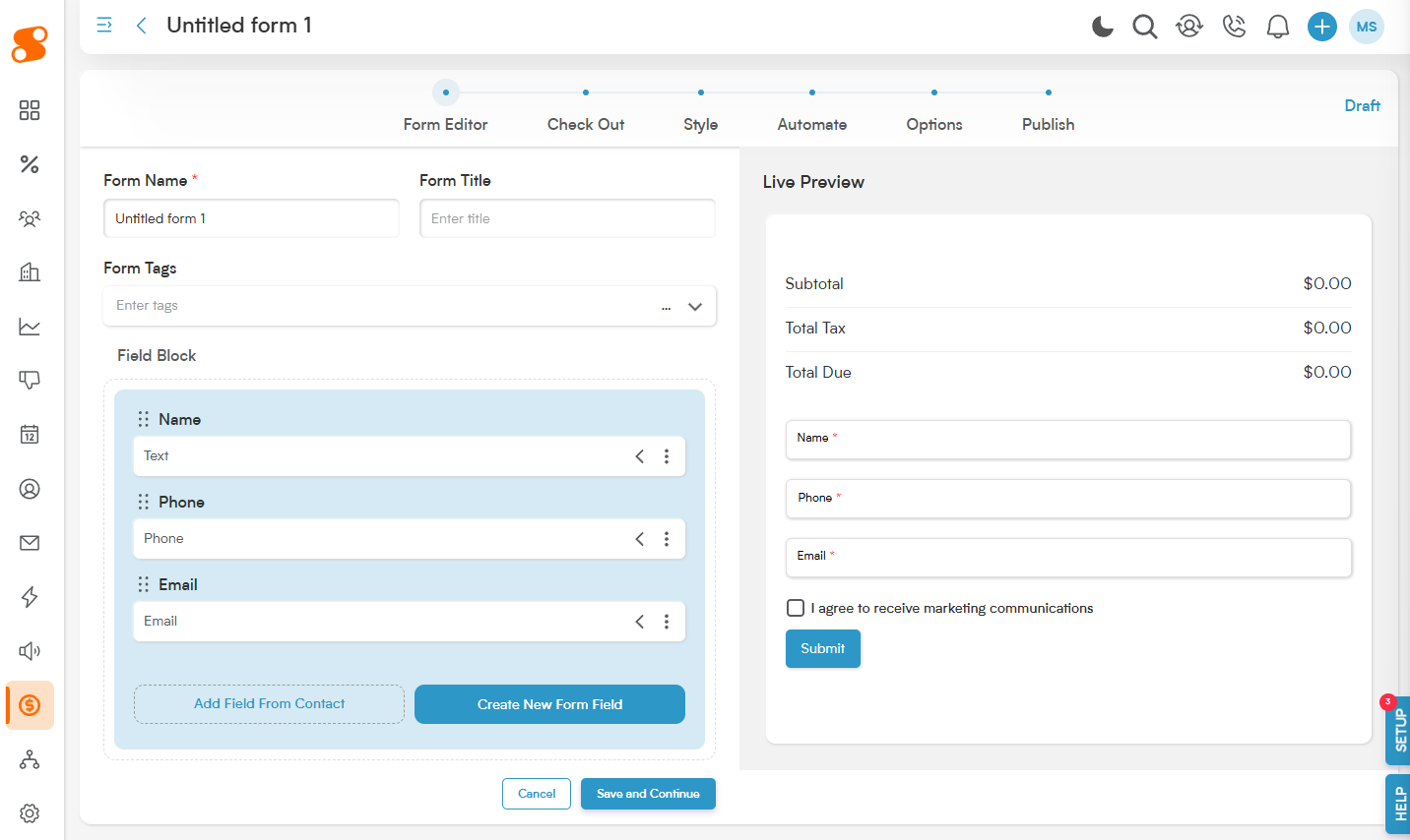
Form Name: The name of the form, for your future reference.
Form Title: The title that will show to the customer when they're filling out the Checkout Form.
Form Tags: To help you search for the forms in the future - you can select tags that have already been created, or add new tags by typing in the input box and selecting the dropdown for the tag you are trying to add.
Field Block: This is the information on the checkout form that you want to gather from your customer. You can add a field from your Contact module, or create a new field with the "Create New Form Field" button. You can also move fields around in the order you want by clicking on the dual vertical dots icon, holding and dragging it into the order you prefer. Note: The information from a "New Form Field" added here does not transfer to your customer or contact's records - this is only for the checkout form.
Checkout Form - Check Out:
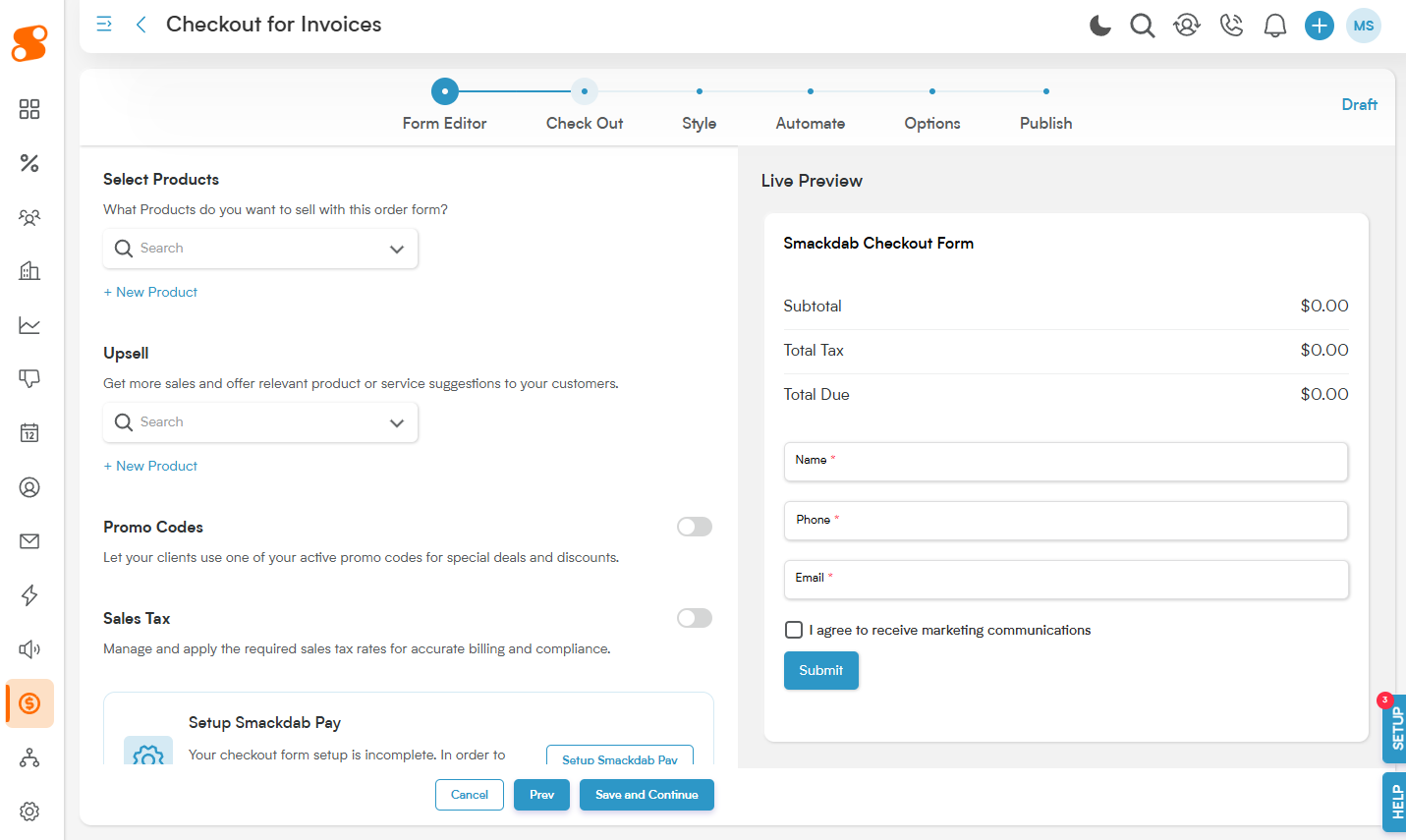
Select Products: These are the products you want to have actively sold on the Checkout Form. For example, if you want the Checkout Form to be for a new product that you've made and the two accessories it needs in order to run, you'll add all three of those items to the Select Products area, and they'll appear on the form by default.
Upsell: These are additional items that you want to offer the customer to be able to add to their "cart".
You can also make the items in the Select Products and Upsell sections Recurring. Once they're added, there is a three vertical dot icon on the right side of each product - click on the icon to access the ability to Edit the item, set it to Recurring, or Delete the item from the form.
Promo Codes: If you want the customer to be able to use a Promo Code on this order, click the toggle to activate their use.
Sales Tax: If this purchase will need Sales Tax added to it, click the toggle and choose the correct Sales Tax option. These rates can be set in Settings>Sales>Sales Tax.
This page will also remind you, if you have not yet done so, to Setup Smackdab Pay - Smackdab Pay is our solution to payment processors. Click "Set up Smackdab Pay" to get started.
Checkout Form - Style:
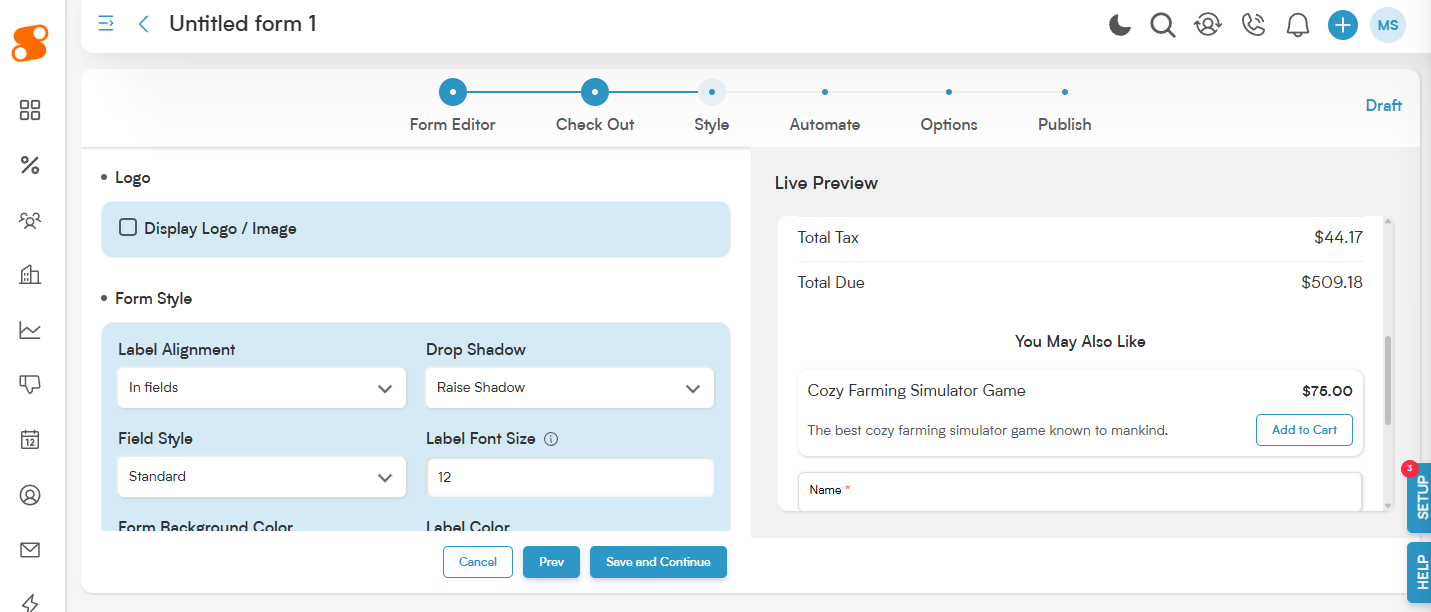
In the Style section, you can customize the form's appearance - including adding a logo, changing the style and colors of the font, adding drop shadows, and other fun additions to make the form yours.
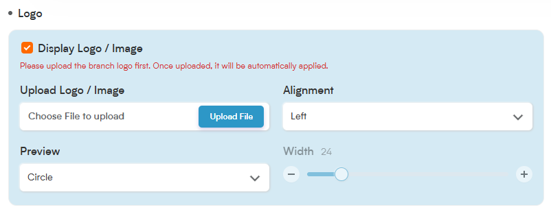
Display Logo/Image: Want to add a personal touch or reinforce your brand? Simply click on "Display Logo/Image" to upload your chosen logo or image directly onto your form.
Alignment: You decide where your image looks best! Choose to align it to the left, right, or center at the top of your form.
Preview:
Circle: This option displays your image as a neat, circular logo.
Square: Opt for a clean look with your logo framed in a rounded-corner square.
Full: Showcase your entire image! Selecting "Full" also activates the Width option, giving you the control to adjust the size of the image to perfectly fit your form's design.
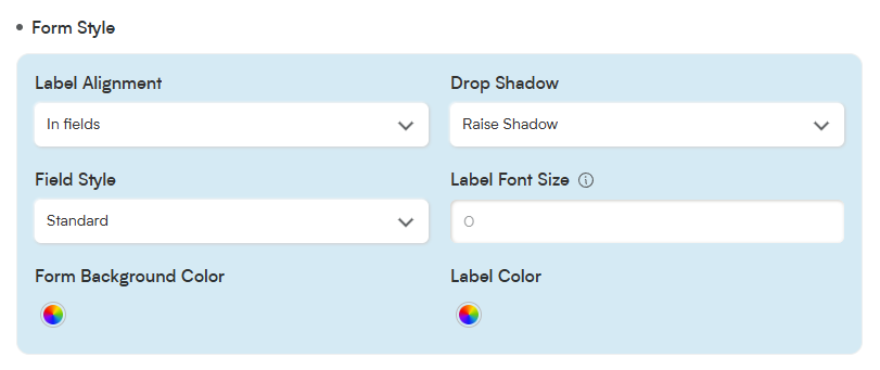
Label Alignment: This shows how the label of each field appears on the form - either In Field, Above Field, or Below Field.
Drop Shadow: Allows you to choose how you want the input boxes on the fields to look - either Raise Shadow, Recess Shadow, or Medium Float Shadow. Play around and see which option you prefer!
Field Style: This changes the shape of the input box of each field. The options available are:
Standard: A clean, flat design for a professional look.
Boxy: Fields with sharp edges and a solid border for a structured appearance.
Rounded: Fields with smooth, rounded edges for a softer design.
Recessed: Slightly indented fields for a sleek, modern effect.
Raised: Input fields with subtle shadows for a 3D effect.
Smackdab Standard: A bold variation ensuring high readability.
Label Font Size: This changes the size of the field labels, from between 12 and 18 pixels.
Form Background Color: Allows you to customize the background color of the form.
Label Color: Allows you to set the color of the field label.
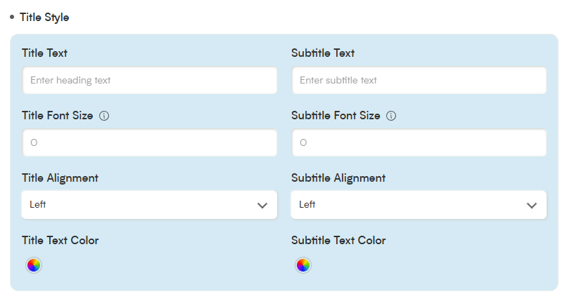
Title Text: You can add a heading text to grab the attention of your customers, or leave it blank.
Subtitle Text: This allows you to add smaller text below the title.
Title Font Size: Set the font size of the title text, between 14 and 40 pixels.
Subtitle Font Size: Set the font size for the subtitle text, between 12 and 26 pixels.
Title Alignment: This will allow you the change the alignment of the title text. The available alignments are left-aligned, right-aligned, or centered.
Subtitle Alignment: Set the alignment for the subtitle text - this can be different from the Title Alignment. The available alignments are left-aligned, right-aligned, or centered.
Title Text Color: Choose any custom color for your title text.
Subtitle Text Color: Choose any custom color for your subtitle text.
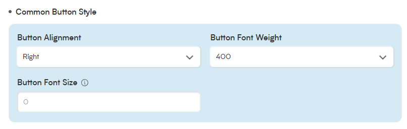
Button Alignment: Allows you to change the alignment of the buttons on the form.
Button Font Weight: Changes the weight style of the text on the buttons.
Button Font Size: Changes the size of the text on the buttons, which can be set between 14 and 40 pixels.
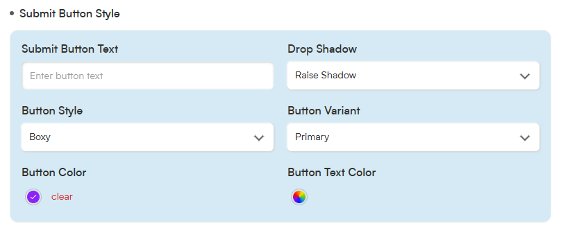
While the Common Button Style section allows you to change the general appearance of both buttons, the Submit Button Style allows you to adjust the text and appearance of the button.
Submit Button Text: This button unfortunately is set to Submit and cannot be changed at this time.
Drop Shadow: Changes the style of drop shadow on the button. Available options are Raise Shadow, Recess Shadow, and Medium Float Shadow.
Button Style: Change the shape of the button between Boxy and Rounded.
Button Variant: Change the style of the button between Primary, Secondary, Outline, or Text.
Button Color: Allows you to pick a custom color for the button.
Button Text Color: Allows you to choose a custom color for the text on the button.
Checkout Form - Automate:
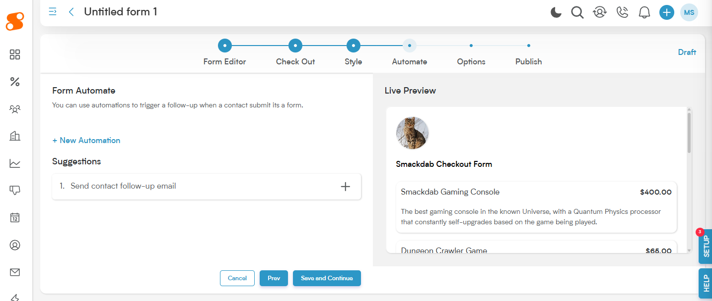
You can choose from an existing Automation (created in Automation module), create a new automation by clicking the "+ New Automation" button, or choose from the suggested automations.
Checkout Form - Options:
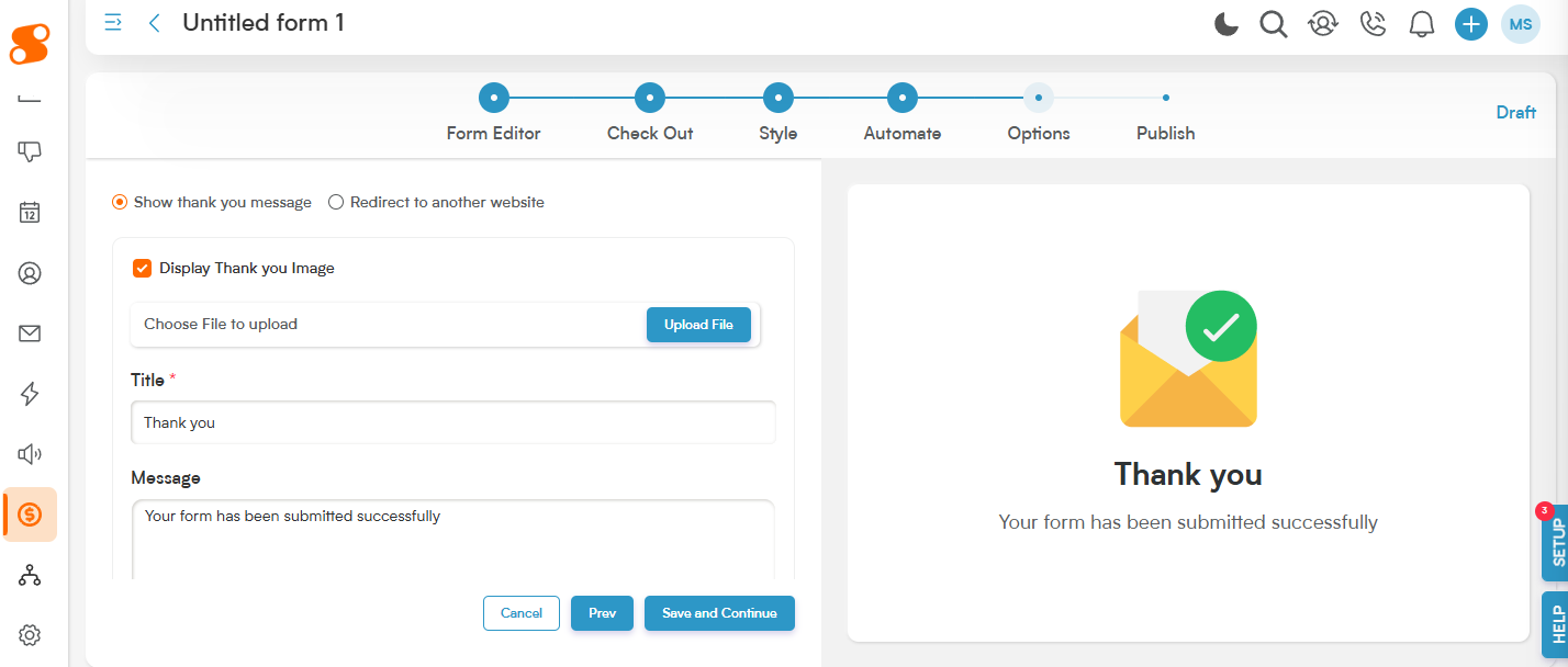
This page allows you to set up what you want the confirmation page to show once the Checkout Form has been submitted by your customer.
Display Thank You Image: You can choose your own image to show on the page or use the default image in Smackdab.
Title: The title you want to show under the image.
Message: The message you want to show for your customer under the image and title.
Enable Honeypot Spam Protection: This keeps you from getting spam bots replying to your checkout form.
Checkout Form - Publish:
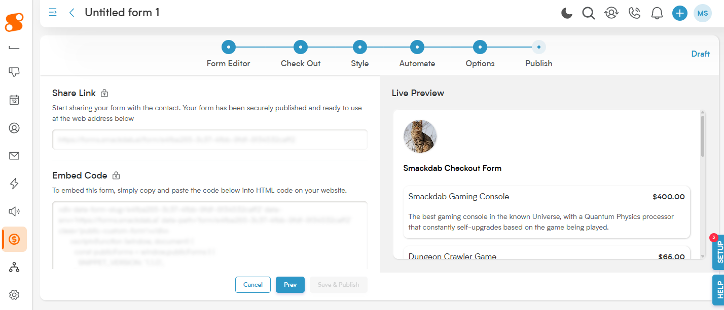
This section allows you to take one final look before making the page live for your customers. It provides you with the link for sharing the checkout form, and a code that allows you to embed the form into your website.
Note: If Smackdab Pay is not enabled and set up completely, you will see that you will be unable to publish the form. If this is happening, check that Smackdab Pay is set up and ready to go - if you are still having issues, click on the "HELP" button in the bottom right of the screen and send us a chat!